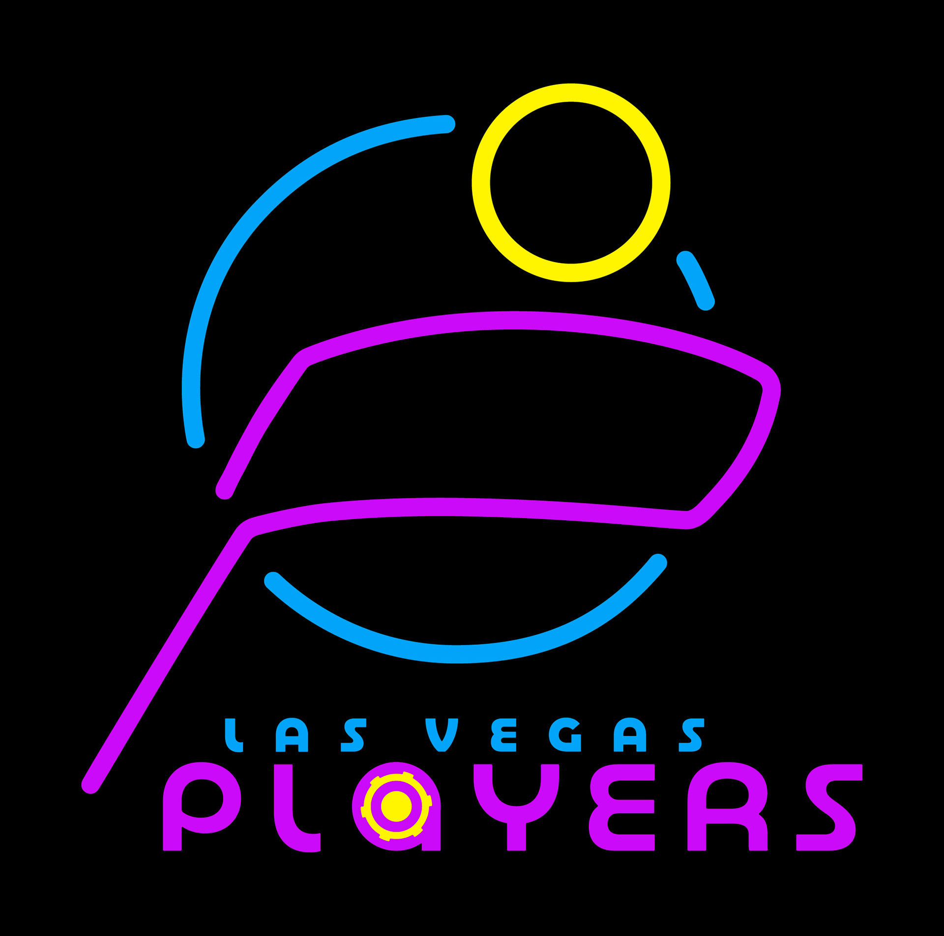
The Las Vegas Players Hockey Club's brand identity is built around research-driven design elements that speak to the consumer need for diversion—entertainment and escape. It utilizes a carefully selected color palette and logo inspired by Las Vegas's world-renowned aesthetic. The result is a cohesive brand identity that systematically fulfills audience desires, combining professional hockey with the gaming spirit of Las Vegas.
The Brand Playbook
Color Palette
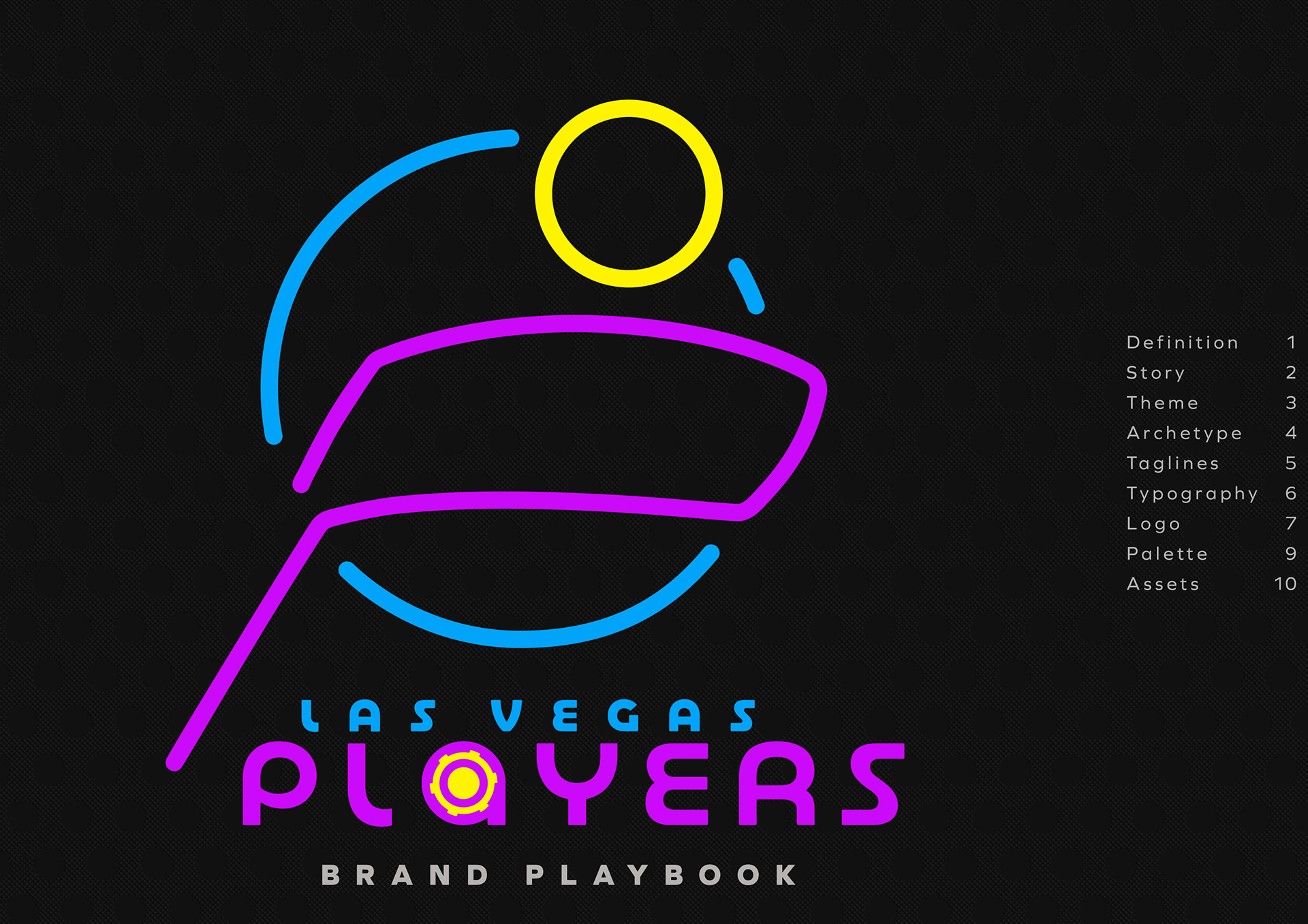
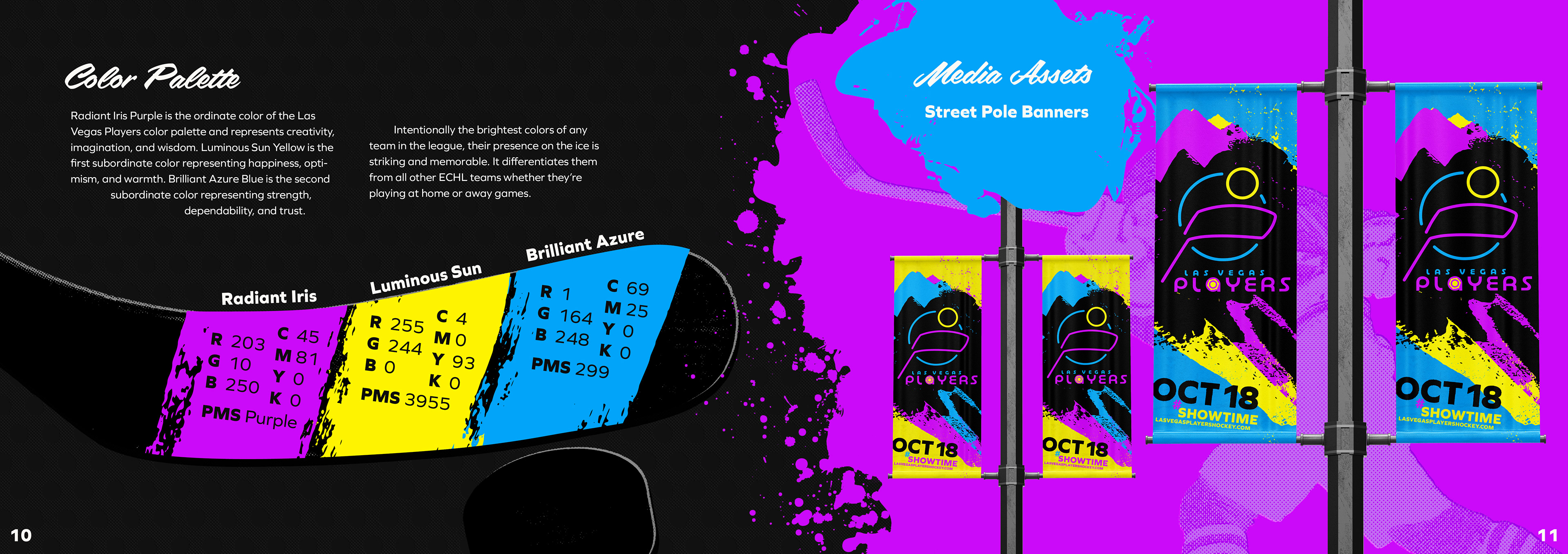
The color selection process goes beyond mere aesthetic considerations. To create a deeply meaningful visual language, founded on color psychology, semiotics, and Western visual communication theory, an ideal 3-color palette was determined from 125 color combinations. Each color was chosen for its psychological associations with creativity, joy, trust, strength, and optimism. The palette engages consumers, supports audience needs for diversion, and offers considerable hockey league differentiation as they are intentionally the brightest colors of any AA hockey league team—a striking and memorable presence everywhere.
Creating the Logo
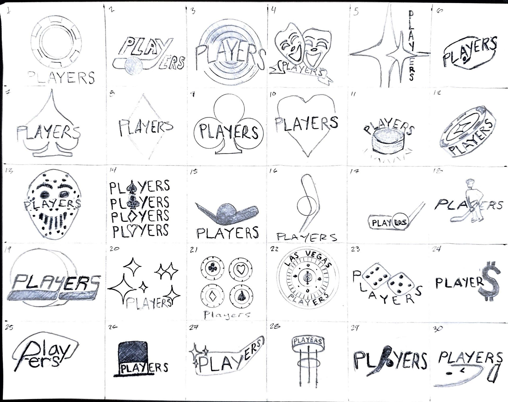
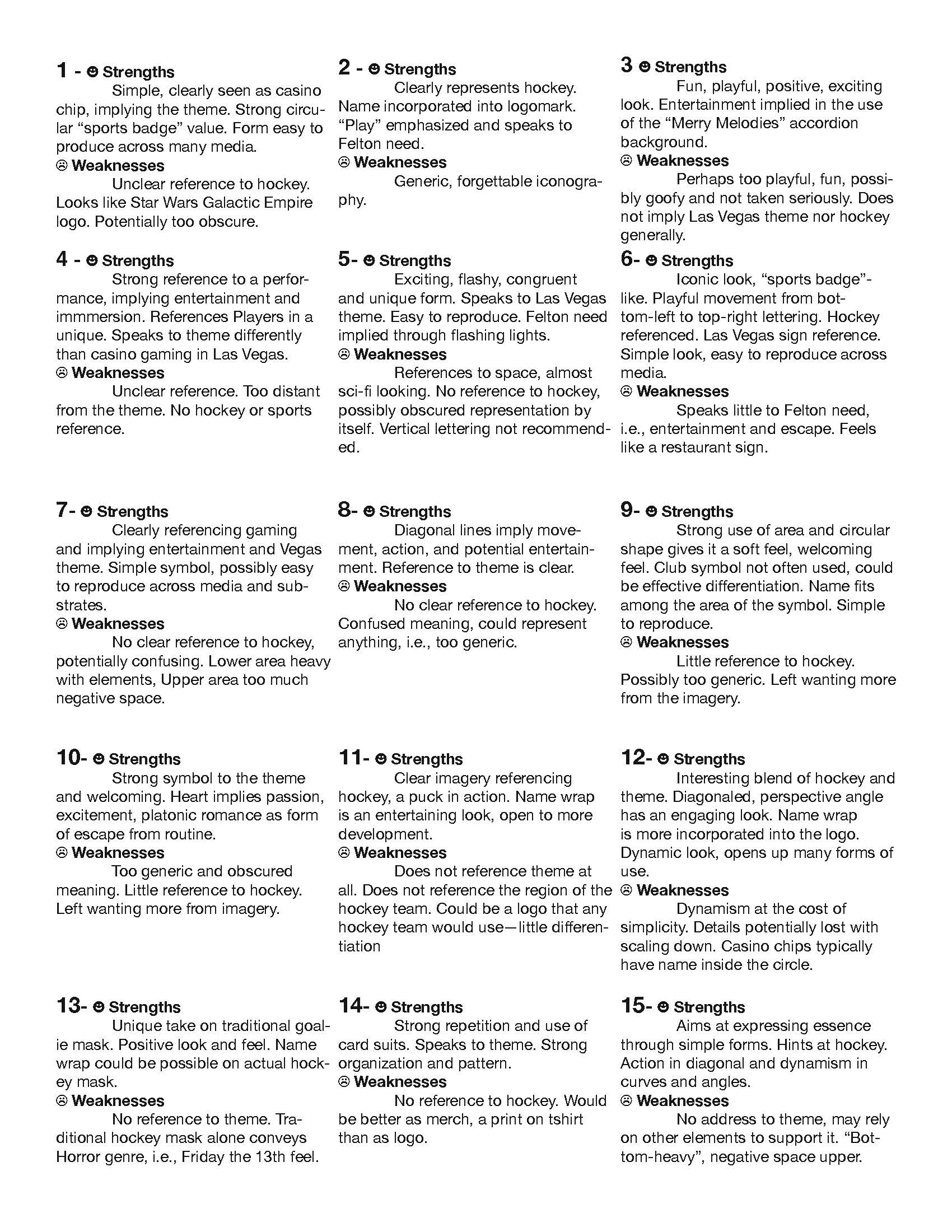
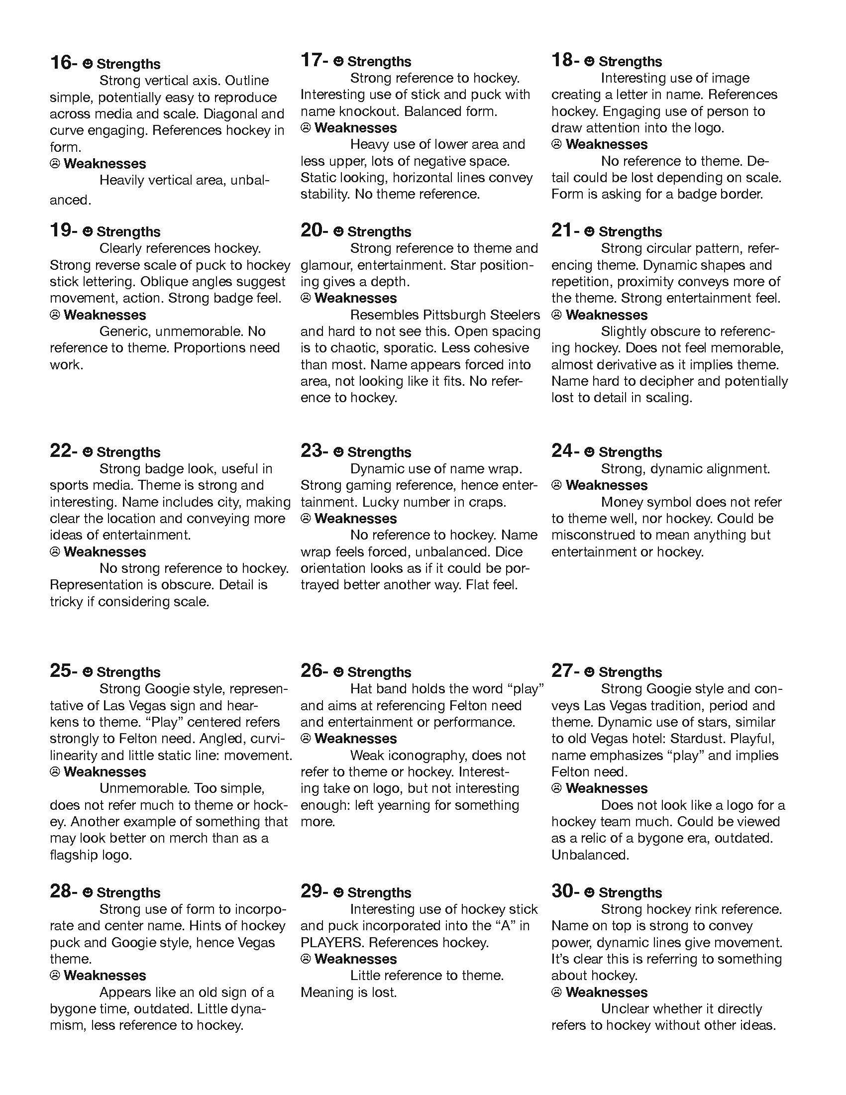
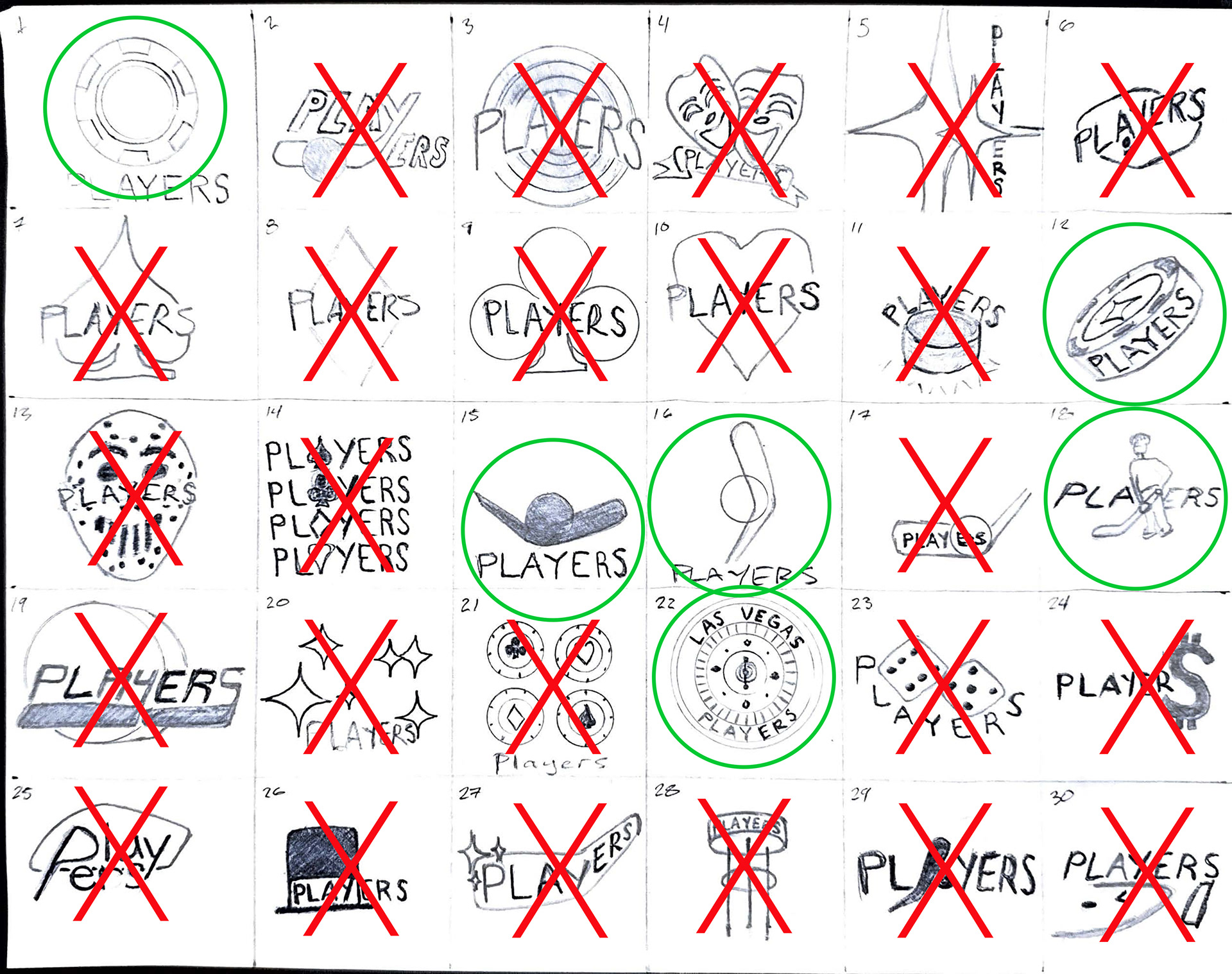
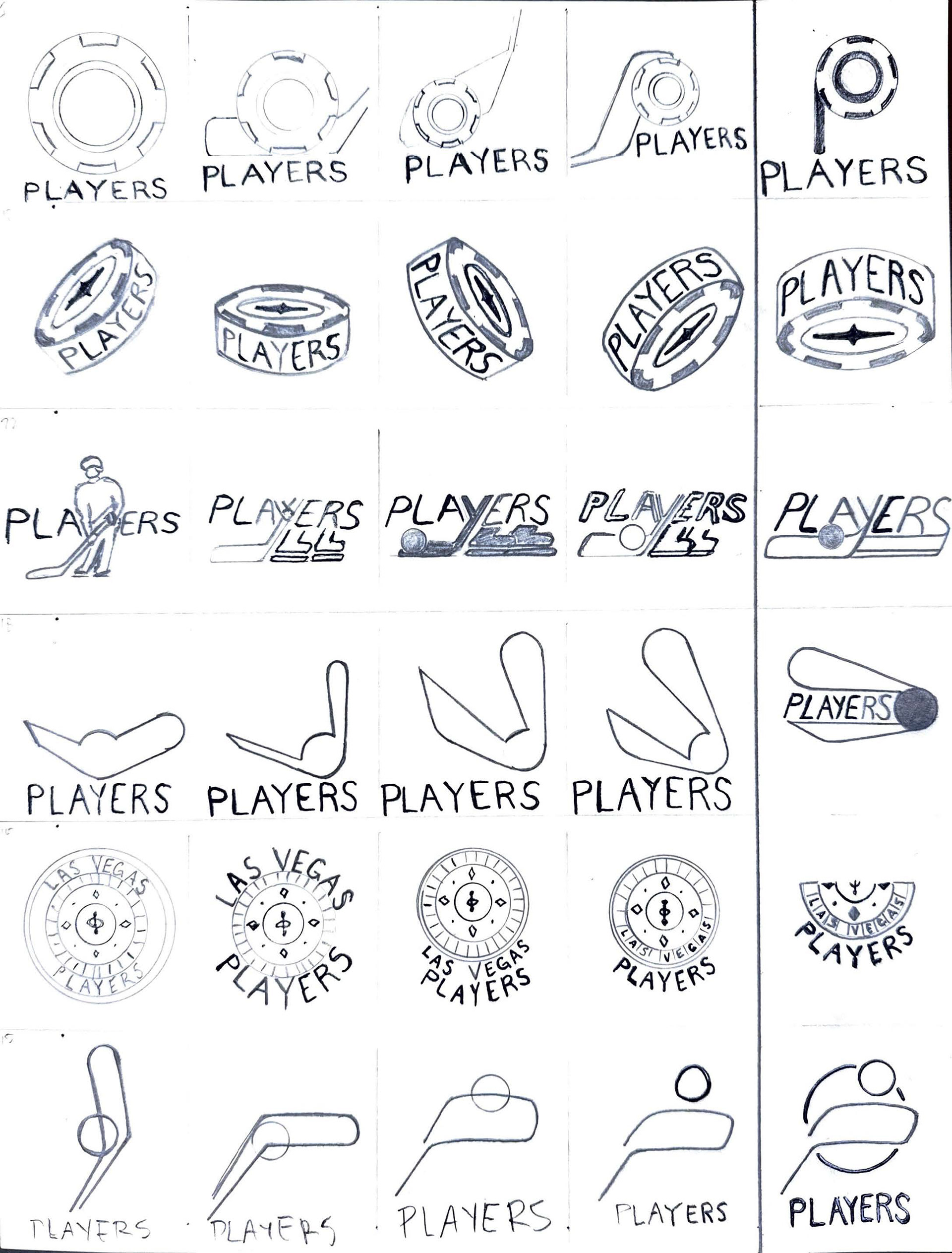
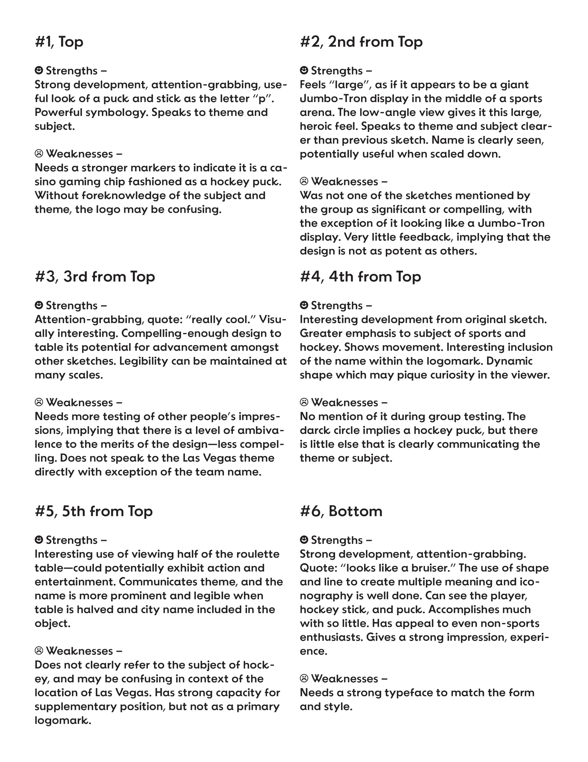
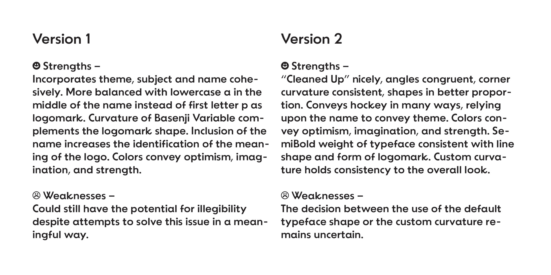
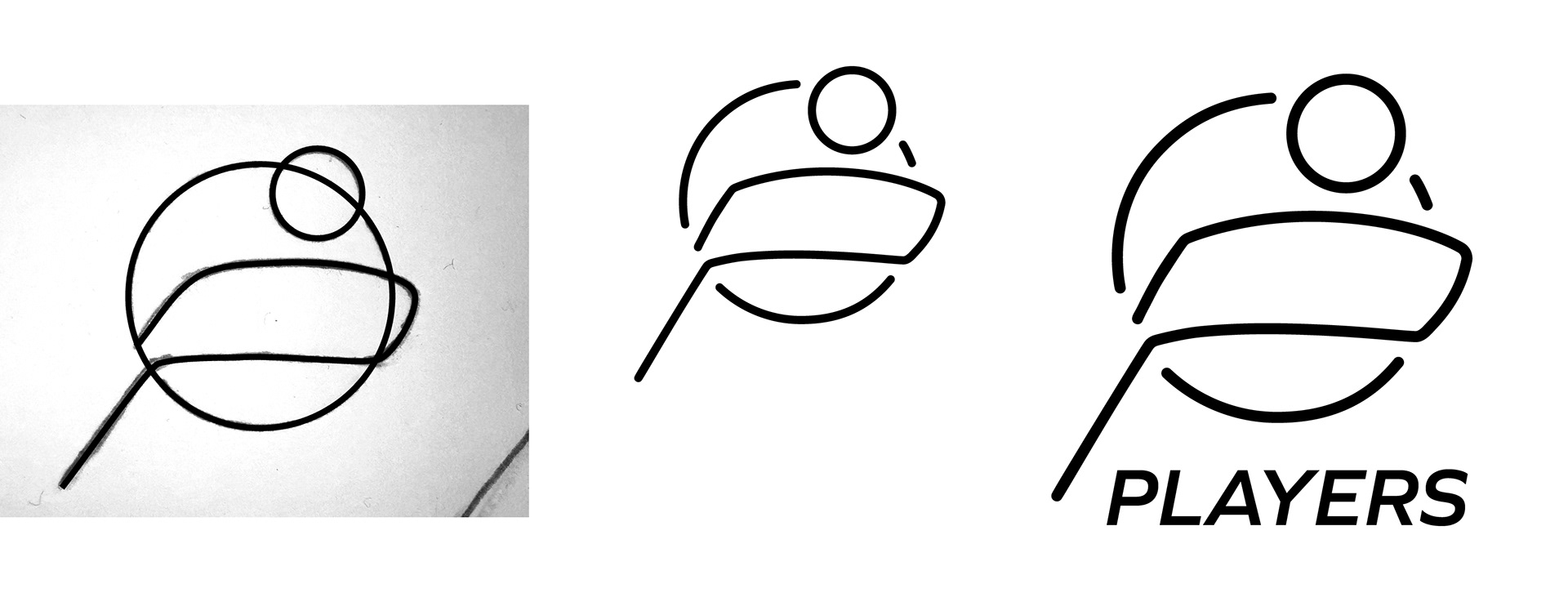
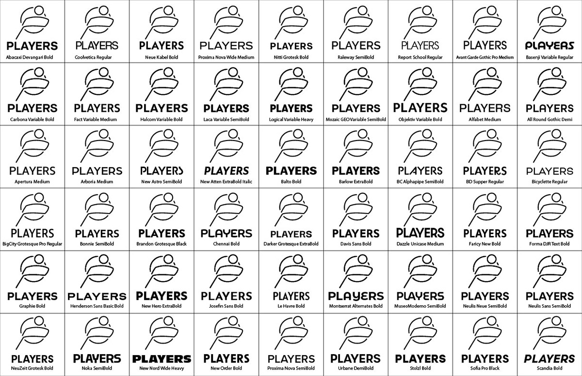
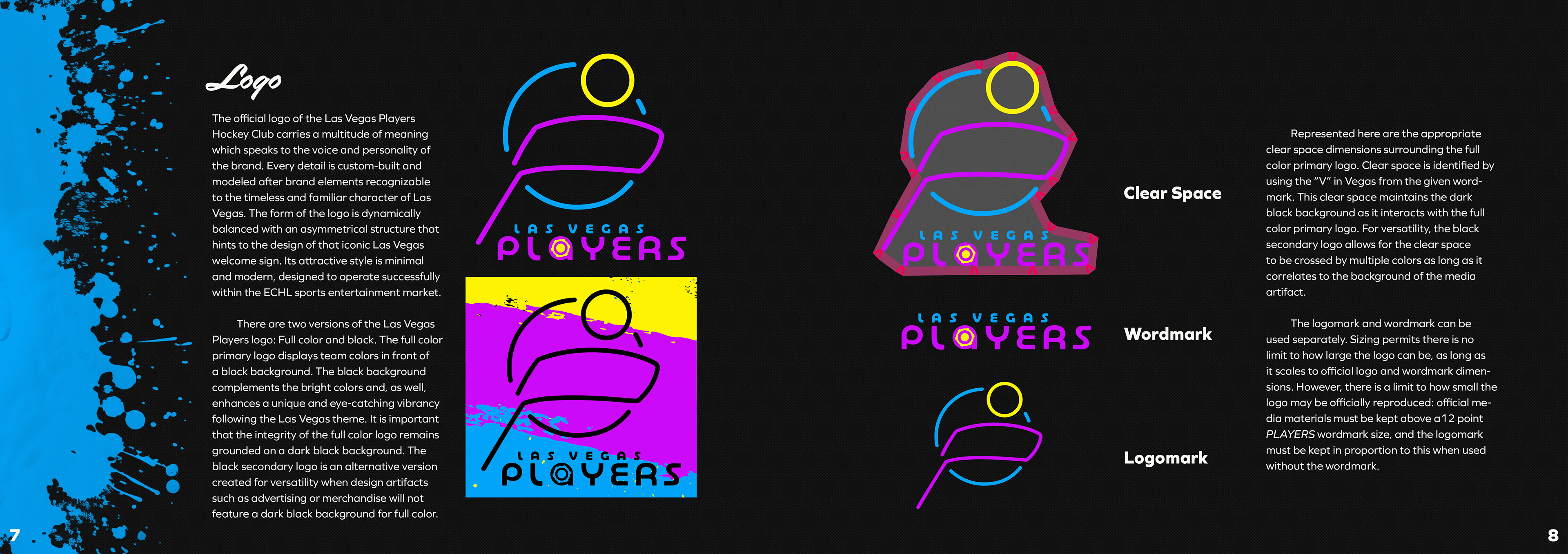
Using iterative processes of divergence and convergence, logo design involved creating 30 initial logo versions and narrowing them down through several rounds of critical assessment. After extensive analysis, six versions were refined and two of those composed the final logo and wordmark. The Players official logo was selected for its clean, minimal design and ability to engage viewers through principles of good continuation and closure: embodying hockey imagery through simple line forms and demonstrating a versatile and strategic approach to brand identity.
